MENU
U18s In Kaunas: Fueled by Optimism
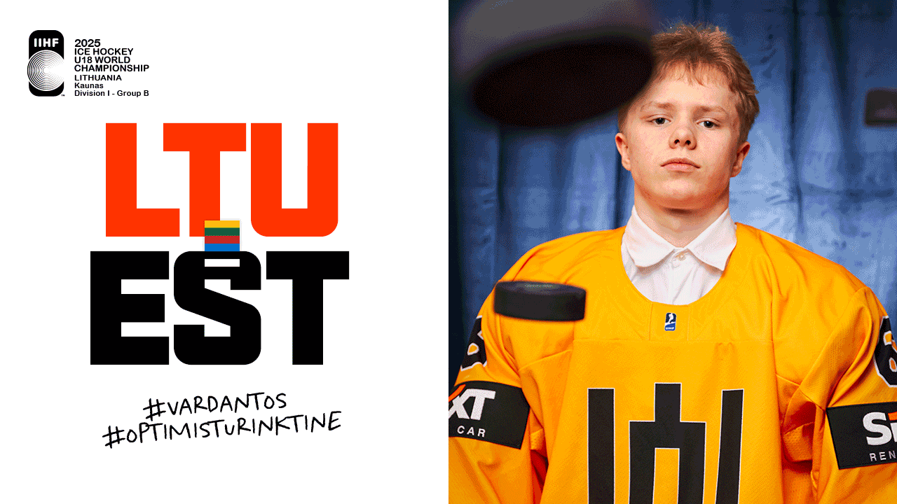
I was invited by Lingėjimai to create the visual identity for the campaign of our U18 Lithuanian National Mens Hockey Team competing in the IIHF World Championship IB division, hosted in Kaunas, Lithuania.
Now, Kaunas is proud of its remarkable modernist architectural heritage. Proper UNESCO-listed beauty, and the smart folks (shout out to Professor Marija Drėmaitė) call it the ‘Architecture of Optimism’.
All those smashing round shapes, bold decisions, that buzzing, forward-looking energy... It immediately struck us how much that resonates with junior ice hockey! The speed, the fearlessness, the sheer energy and potential – it’s optimism in motion, not to mention the round shape of the puck. So, we adopted the ‘Optimism’ concept for the championship’s visual identity and communication. We also took a slightly different approach with the team photoshoot, moving away from the standard game-face portraits.
I was invited by Lingėjimai to create the visual identity for the campaign of our U18 Lithuanian National Mens Hockey Team competing in the IIHF World Championship IB division, hosted in Kaunas, Lithuania.
Now, Kaunas is proud of its remarkable modernist architectural heritage. Proper UNESCO-listed beauty, and the smart folks (shout out to Professor Marija Drėmaitė) call it the ‘Architecture of Optimism’. "All those smashing round shapes, bold decisions, that buzzing, forward-looking energy... It immediately struck us how much that resonates with junior ice hockey! The speed, the fearlessness, the sheer energy and potential – it’s optimism in motion, not to mention the round shape of the puck. So, we adopted the ‘Optimism’ concept for the championship’s visual identity and communication. We also took a slightly different approach with the team photoshoot, moving away from the standard game-face portraits.


THE TASK AT HAND
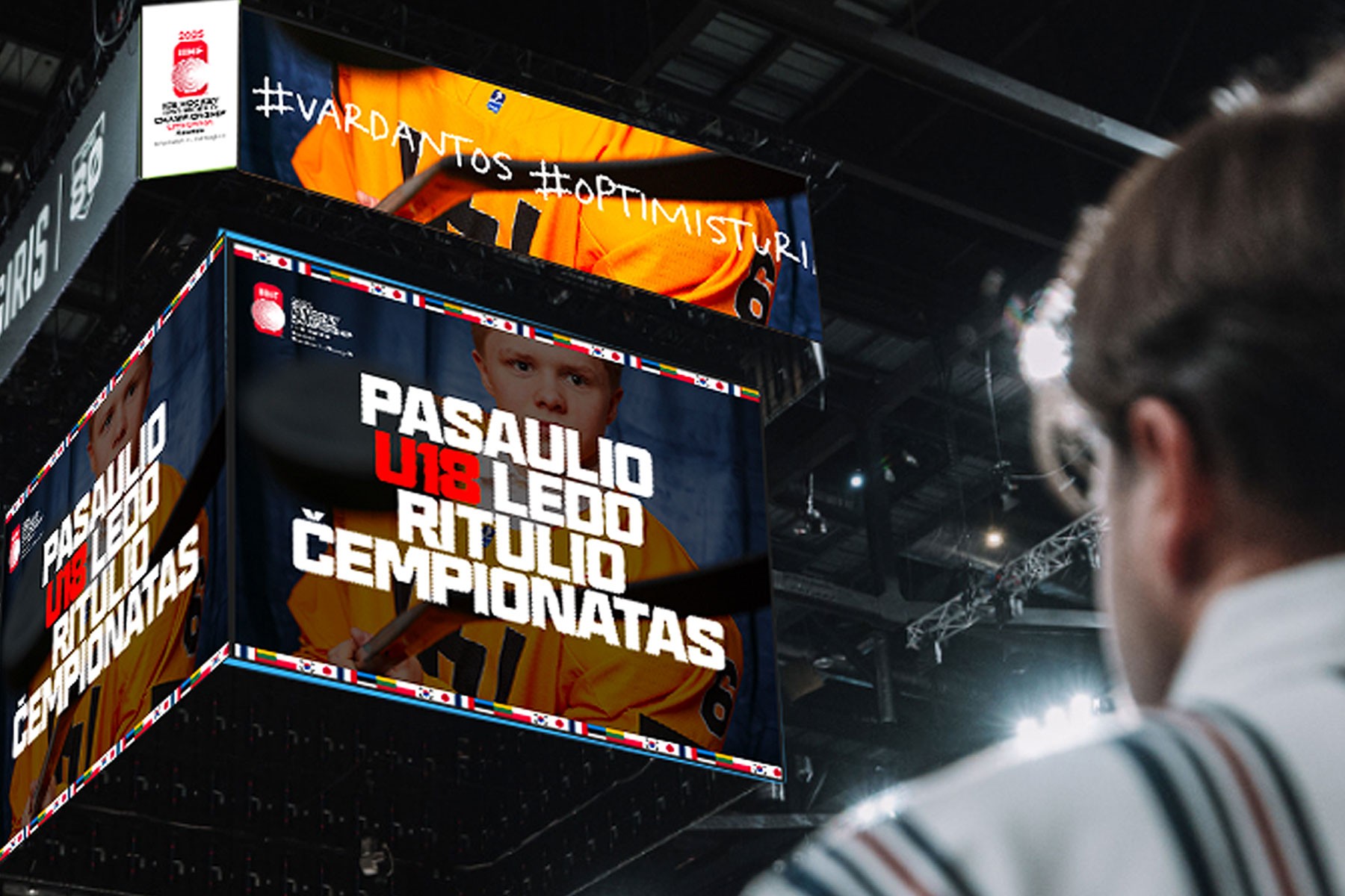
The goal was to craft a bold, youthful identity for both the tournament and the U18 Mens National Team—one that felt expressive, energetic, and fun. I developed the full visual system across all touchpoints, including print, social media, and on-court design. I also created the official tournament logo - separate case study coming soon!
ALL-AROUND DESIGN APPROACH
My task was simple - make the tournament, as well as the U18 National Team, look youthful, expressive, and fun. I was responsible for the whole visual identity of the campaign - from print, to social, to on-court design elements. As a little side note - I also took up the job of designing the logo for the tournament itself (a separate case study incoming!).
VISUAL DIRECTION
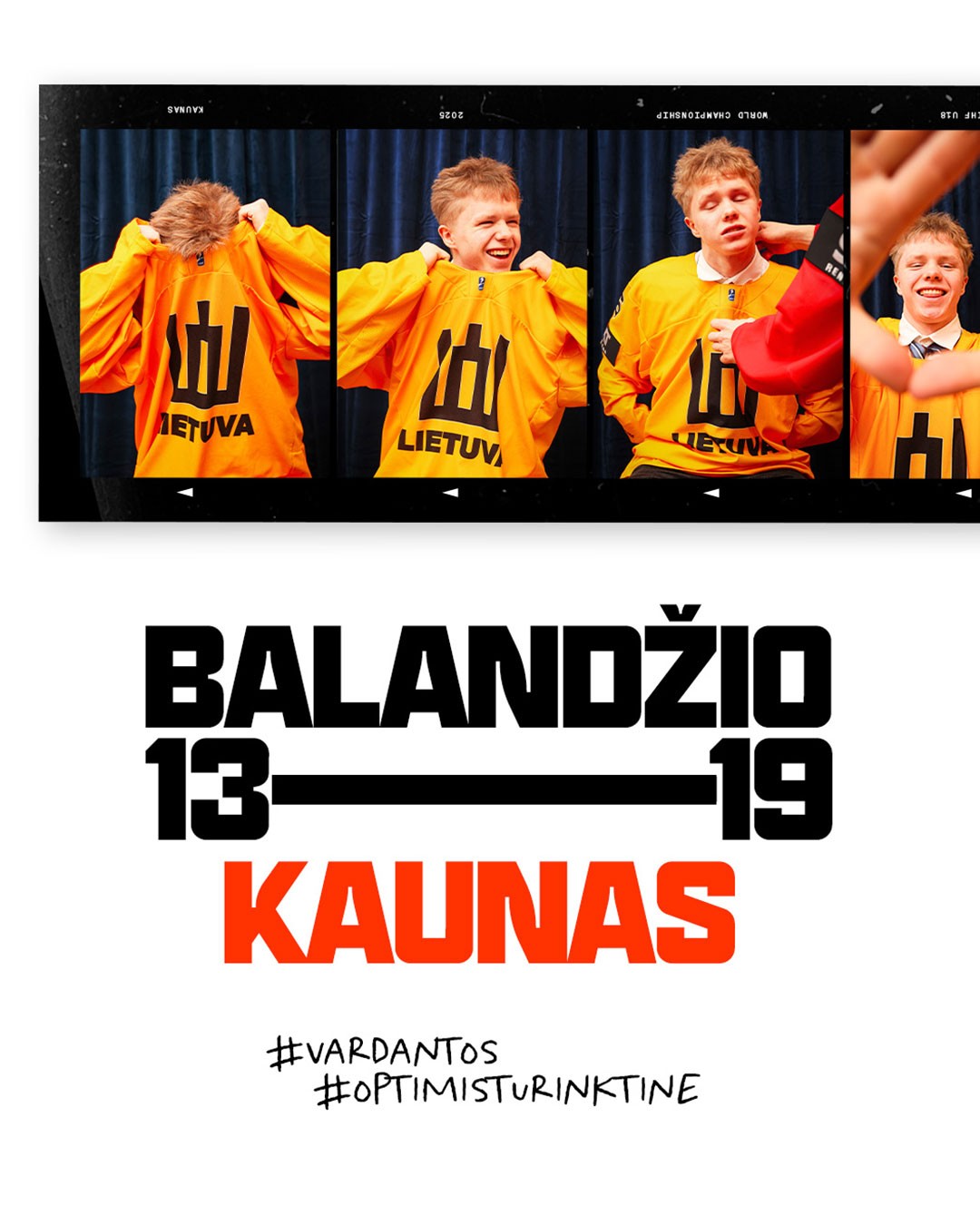
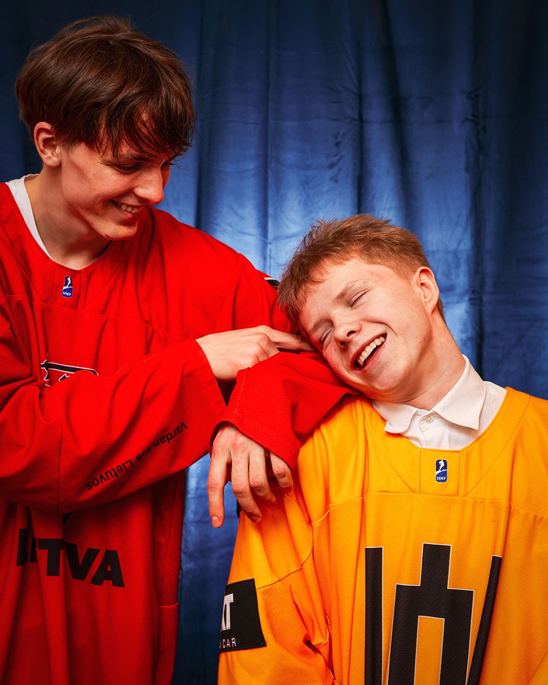
The visual language drew inspiration from rounded forms in modernist architecture, paired with bold, youthful typography and a high-contrast color palette that elevated the photography. The photography played a central role in shaping the campaign’s look and feel—capturing a playful, DIY photobooth vibe where teens are simply being themselves. It served as a visual metaphor for the spirited, free-flowing nature of junior hockey.
VISUAL DIRECTION
The visual language developed was built around rounded shapes found in modernist architecture, as well as bold yet youthful typography and a high-contrast color palette to compliment the photography style. The photography style itself became a key element in the look&feel of the campaign, with the images taking you on a DIY photobooth-style shoot, where teenagers are simply letting loose and having fun - an analogy to the style of play junior hockey offers the spectators.


TREMENDOUS RESPONSE
Every Lithuania game was a sell-out, packing the Kaunas Ice Palace. The atmosphere was genuinely electric throughout. While the team secured a hard-fought silver medal in the final, that bright, optimistic spirit and fantastic crowd support carried through right to the very end.


Project Manager Kęstutis Lingys Photos by Themba Wahlstrom Shoot assistant Adelė Žilinskaitė-Vaškevičė Copywriter Kotryna Lingienė Art Director & co-producer Andrius Vaškevičius
Design Kris Kala Players Mykolas Škadauskas & Pijus Pranskevičius


Books closed